View only UI shots
Product
2022
Overview
With the launch of Give 3.0, I decided to take the initiative to redesign our donation forms to enhance our donor experience. My focus was on our two main form layouts: Classic and Multi-step.
In this case study, I will address only the Classic form layout. The main goal was straightforward: improve the donor experience and ensure consistency in our UI.
I audited our current donation forms and identified areas for improvement. I will break down the form into sections to make it easy to understand my approach and the reasoning behind the changes.
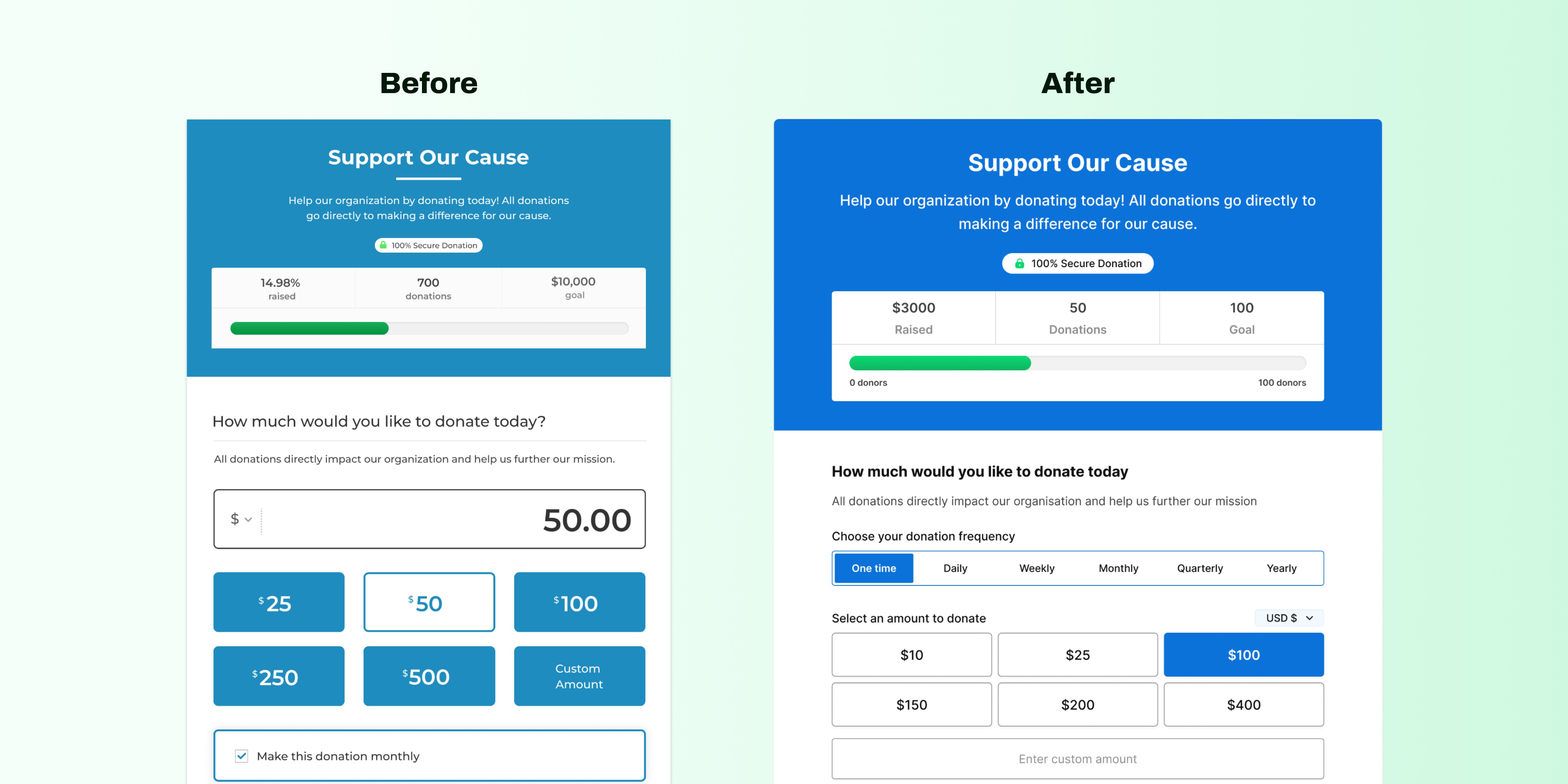
Header Section
This is where the title and description, image, and the donation goal progress of your form goes to. The goal was to keep this section clean and intuitive.
Audit Findings
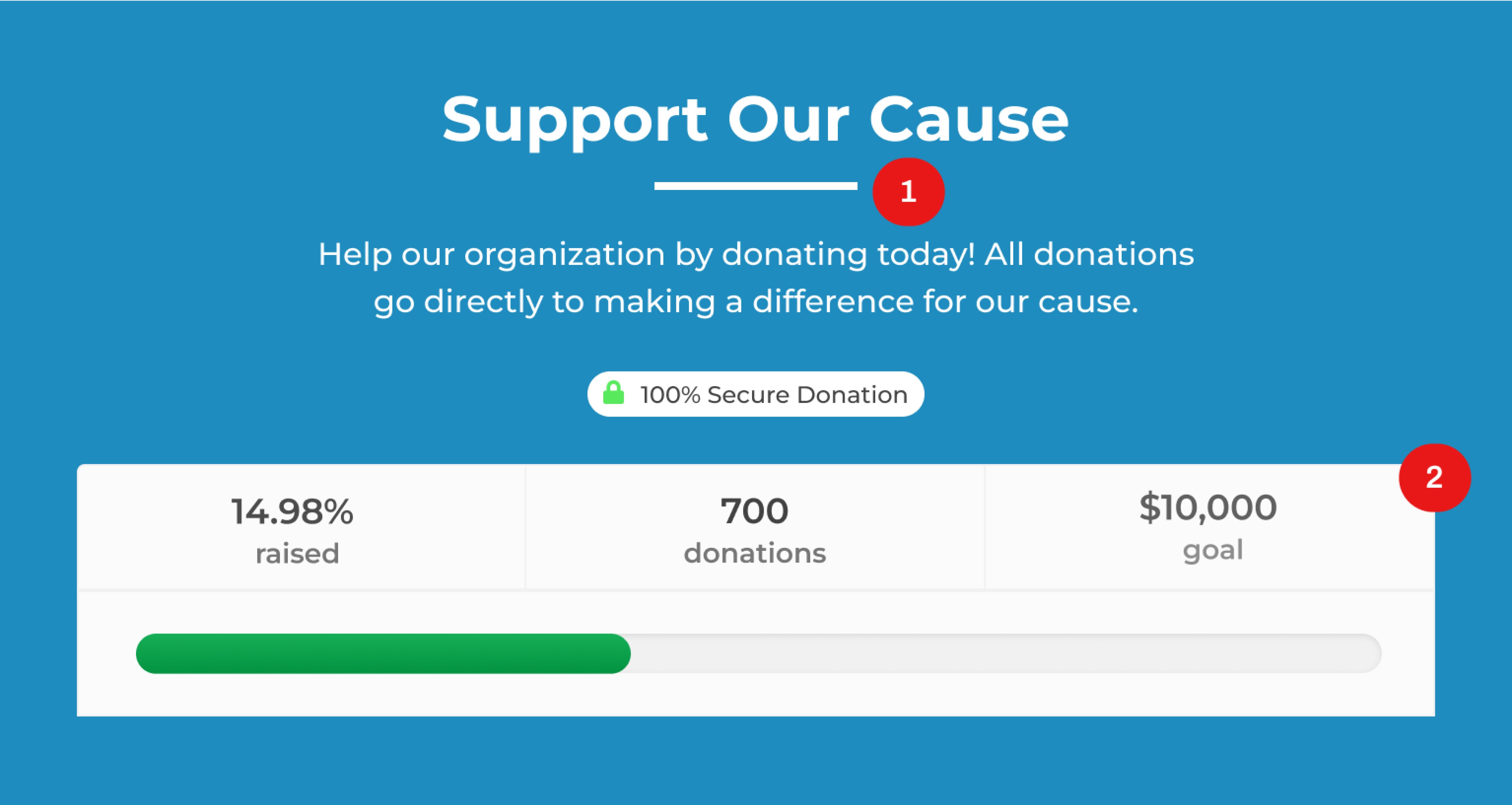
The underline beneath the title wasn't relevant; it's obvious that this is the heading of the section.
Some donors were finding it difficult to understand the goal type. Our core goal types, aside from the amount raised, are the “number of donors” and “number of donations”. While the dollar symbol denotes the amount raised, the text "goal" beneath the number isn't clear enough for the number of “donors” and “donations”. This was not clearly understood with our current goal component.
Solution
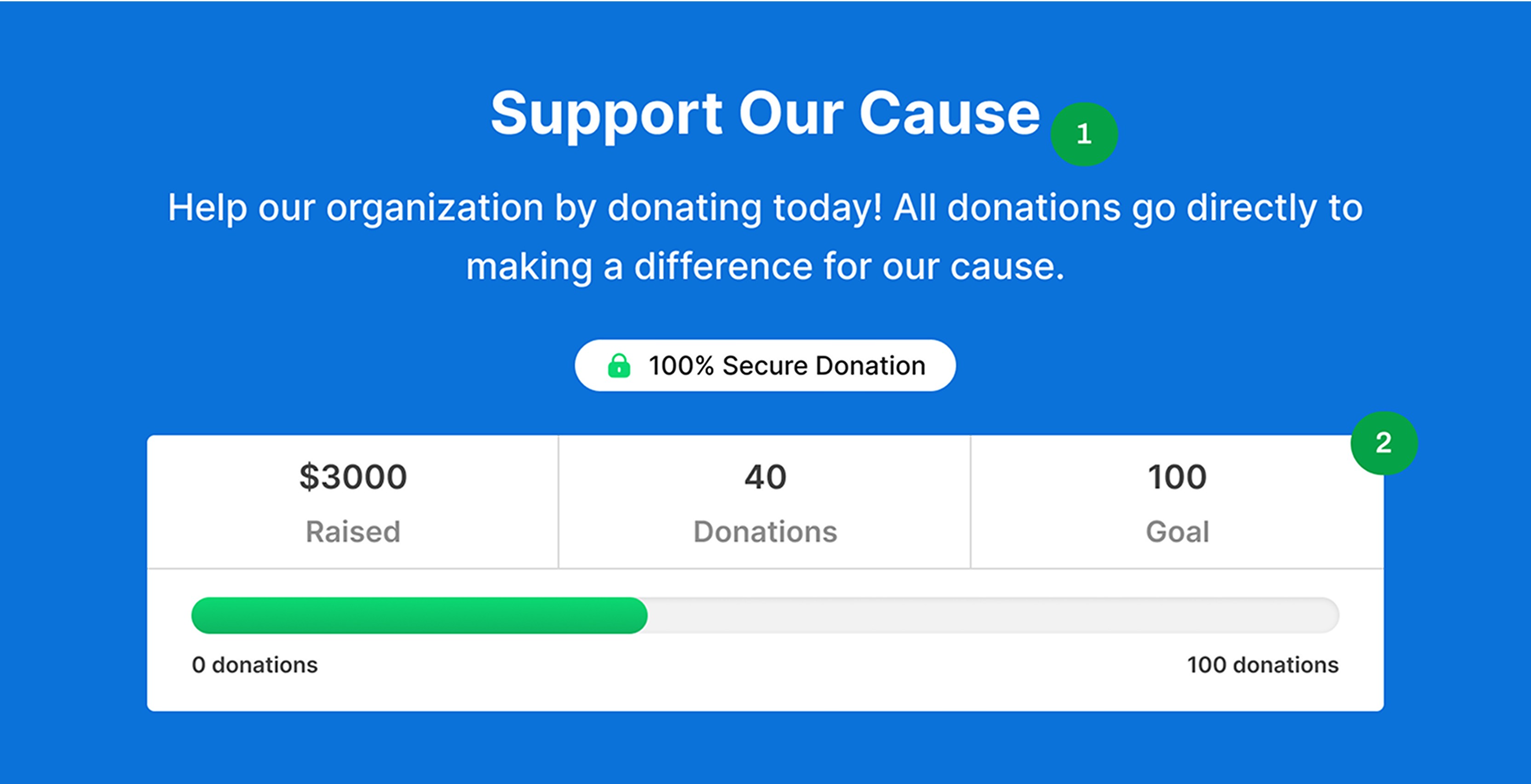
Removed the underline and made the heading more prominent.
To avoid confusion, I added context to the donation goal bar by highlighting the donation goal type beneath it. This gives more clarity on the type of goal.
Donation Amount Section
This is where donors make a decision with regards to the donation amount. Our goal here was to make it easier and faster for donors to make a decision.
Audit Findings
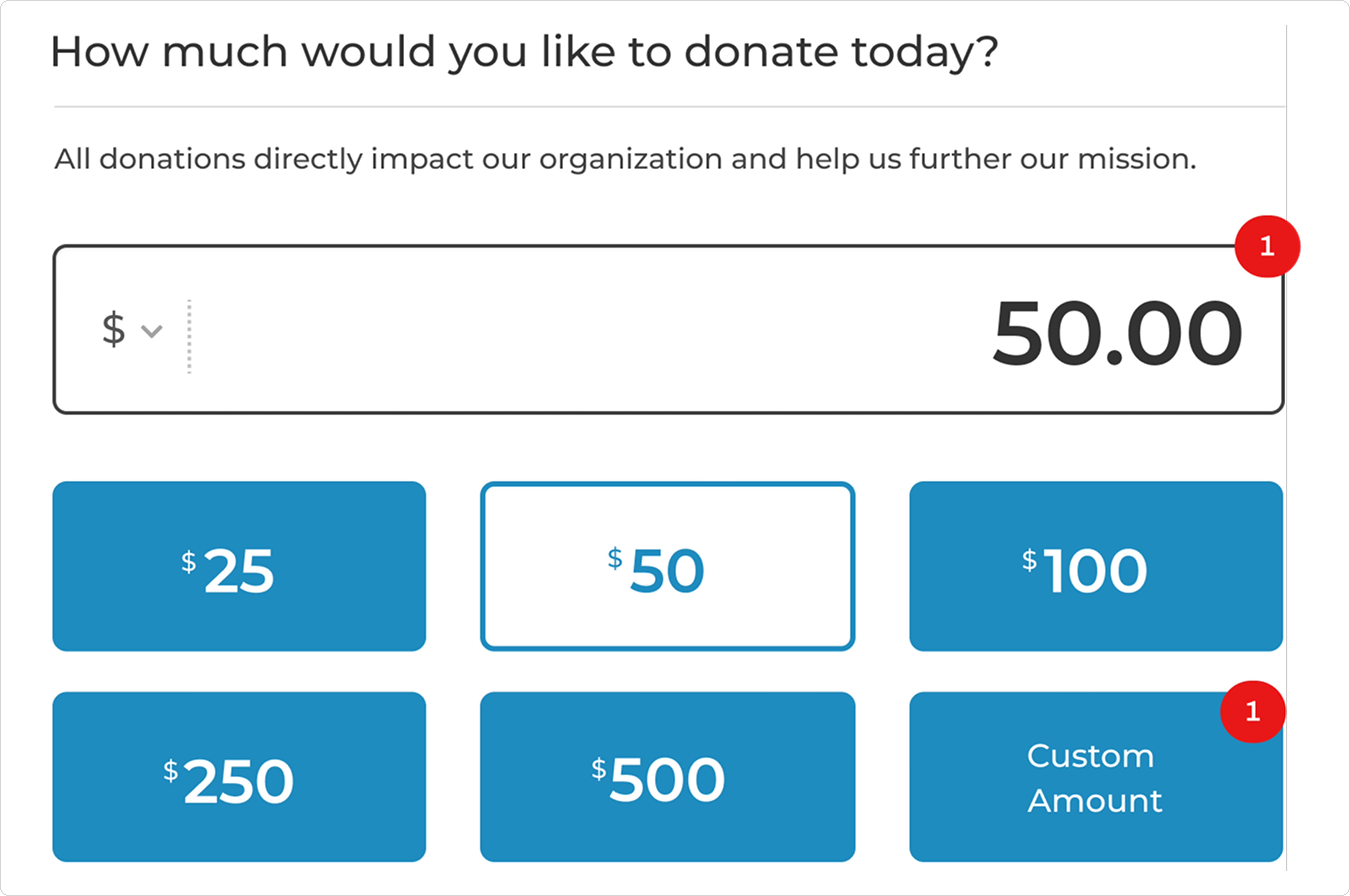
The custom amount field serves as both an input and a display field for any selected donation amount, which can be confusing.
Secondly, we want donors to make decisions as quickly as possible, and having the custom amount as the first option complicates this process because it requires them to think of a specific figure to donate.
Lastly, the custom amount button in the donation amount levels is redundant; selecting it simply activates the custom amount field, which can also be done by directly selecting the custom amount field.
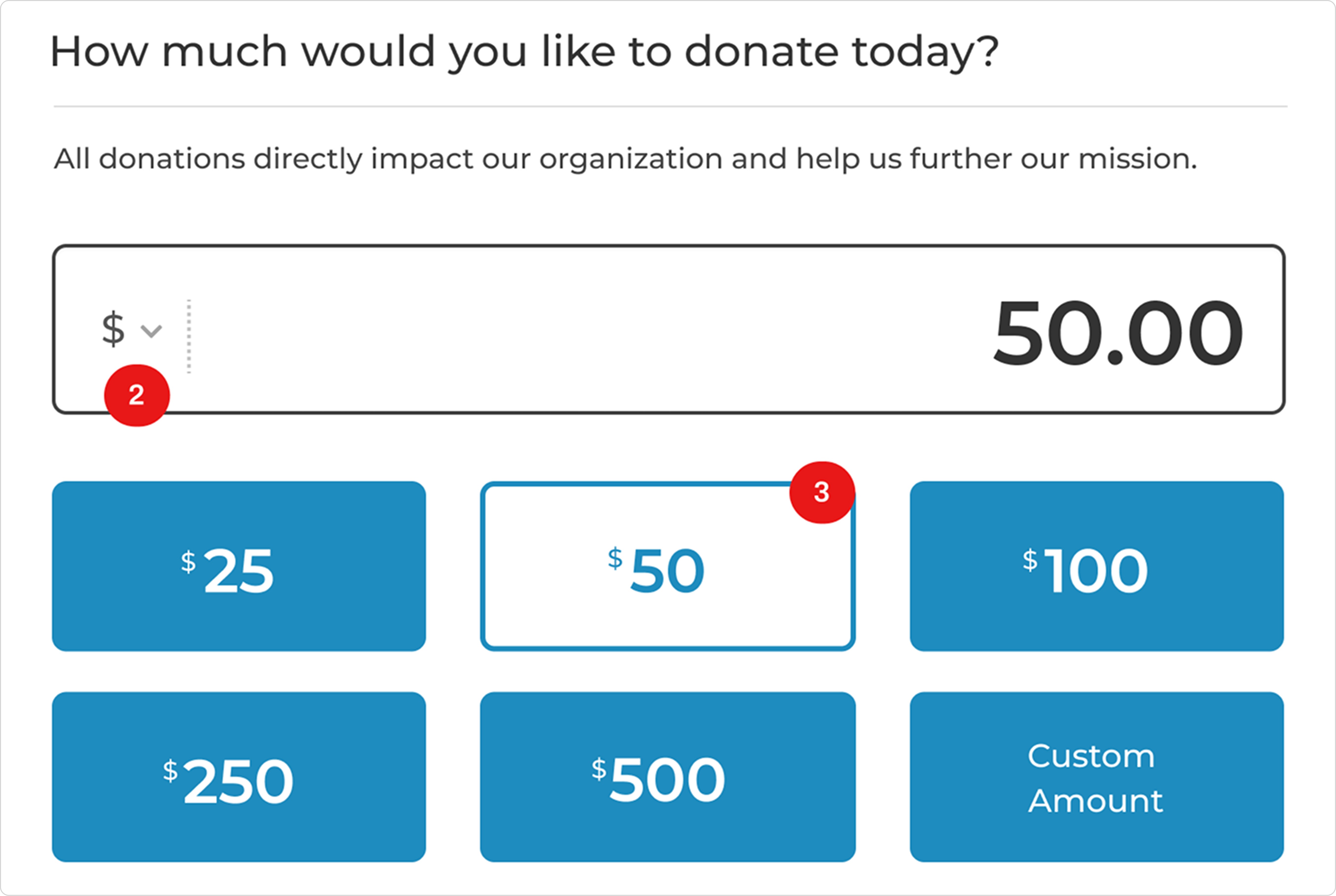
Switching currency is currently done in the custom amount field, which gives the impression that it only applies to the custom amount. However, this selection also affects the donation amount levels.
The current active state of a selected donation amount, while standing out from the rest, makes it difficult to quickly scan the options. The primary state of the other buttons also demands attention, causing users to spend more time making a decision.
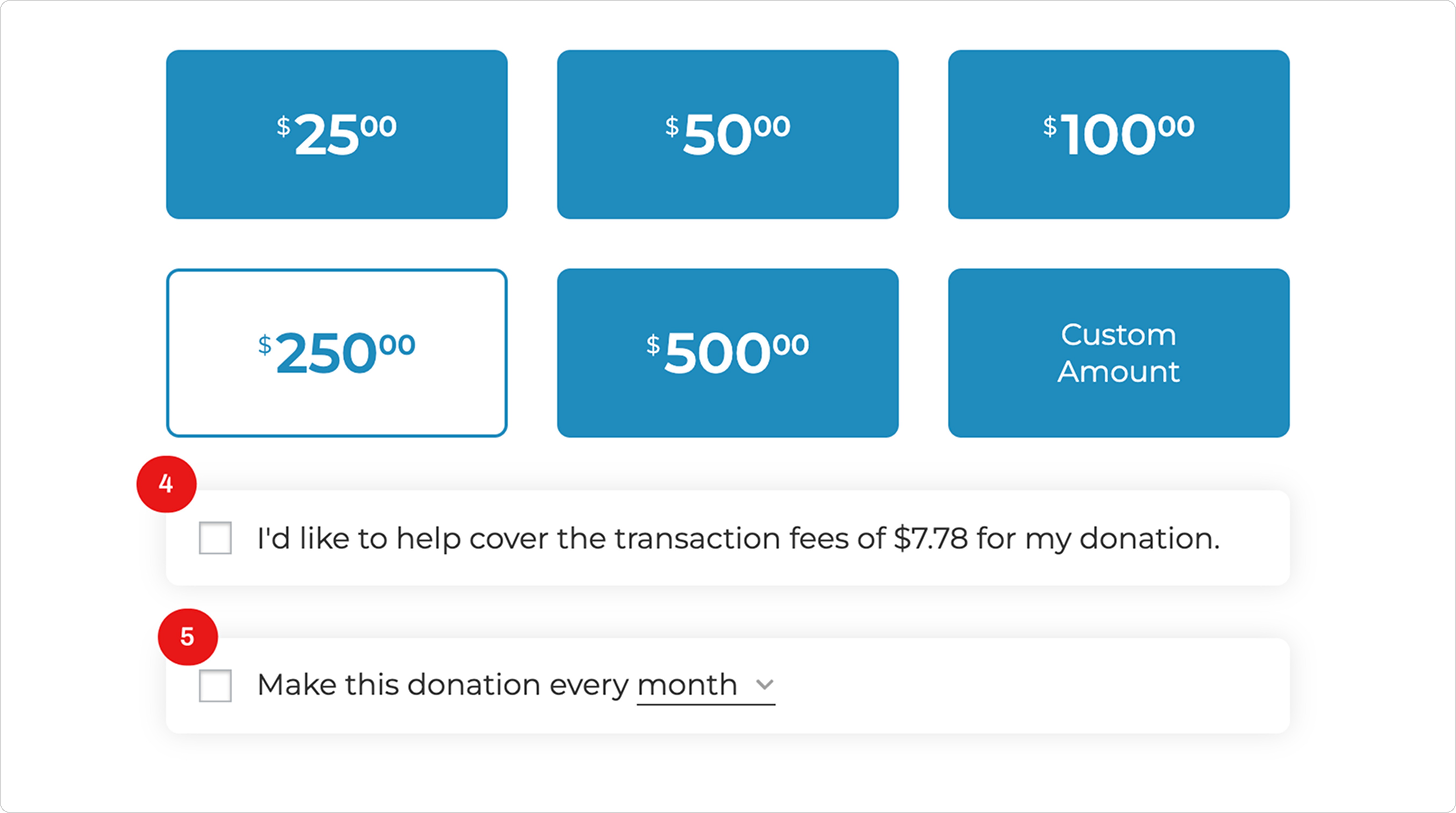
The theme for our UI components was to go with a flat design with less emphasis on shadows.
Currently, users take three steps to make a decision: selecting the checkbox, selecting the dropdown, and choosing their preferred frequency. This increases the time spent on making a decision.
Additionally, the frequency selection can be easily missed with this component. Lastly, the recurring donation option is the last shown in this section, decreasing the chances of donors opting for a more impactful recurring donation.
Solution
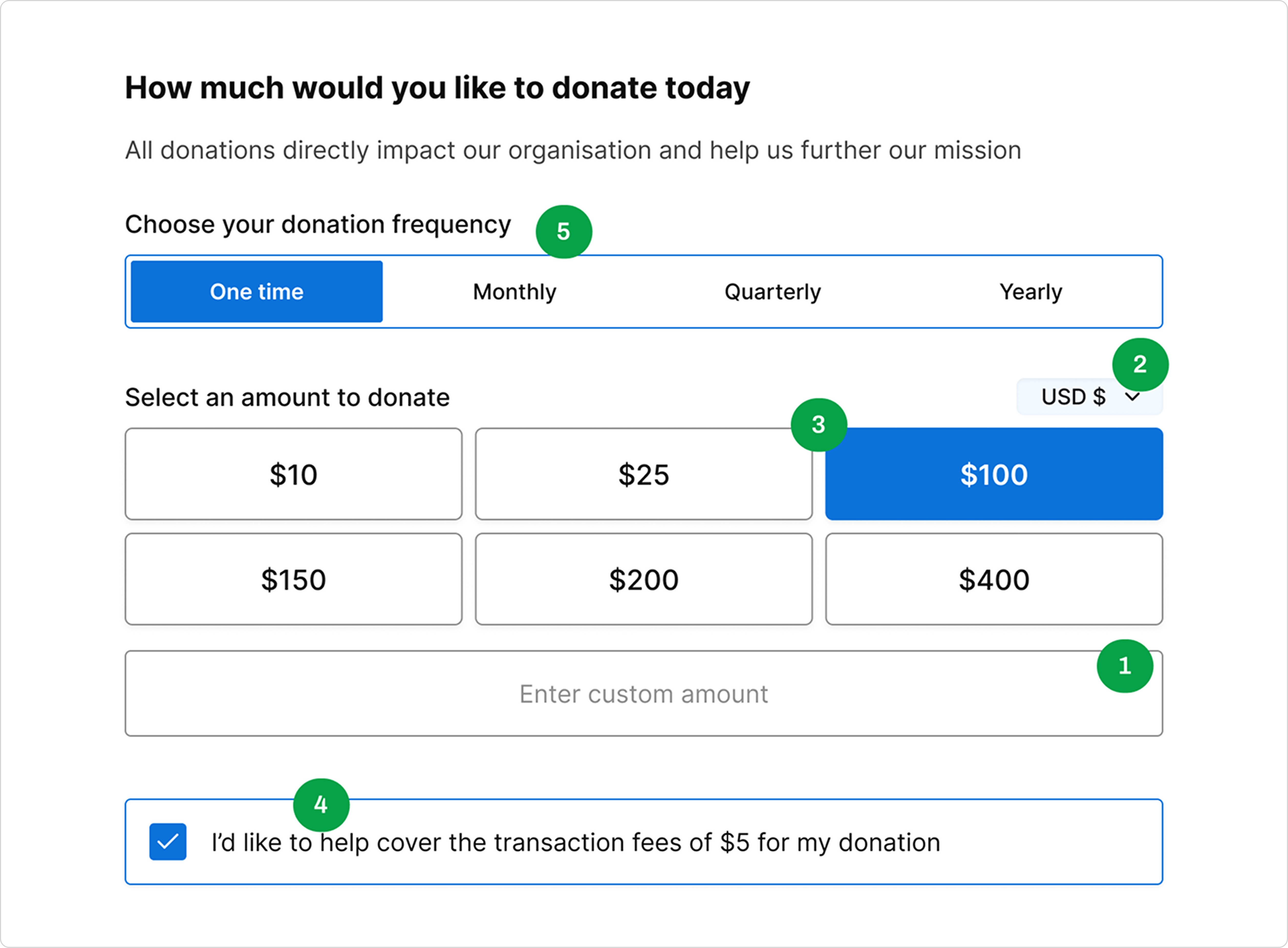
Removed the custom amount from the amount grid and positioned the donation amount levels above the custom field to enable donors to make decisions faster.
Positioned the currency switcher above the donation amount levels and custom amount field to clearly indicate how their action changes the currency at the top level.
Changed the active state of the selected amount and the default state of the donation amounts to improve scanning and reduce the time spent on selecting a donation amount.
Removed the shadow and used a border to differentiate from a default checkbox with a label.
Changed the design of the recurring component to a tabs format to reduce the time spent on making a decision and moved it to the top of this section to increase the chances of donors making a more impactful donation.
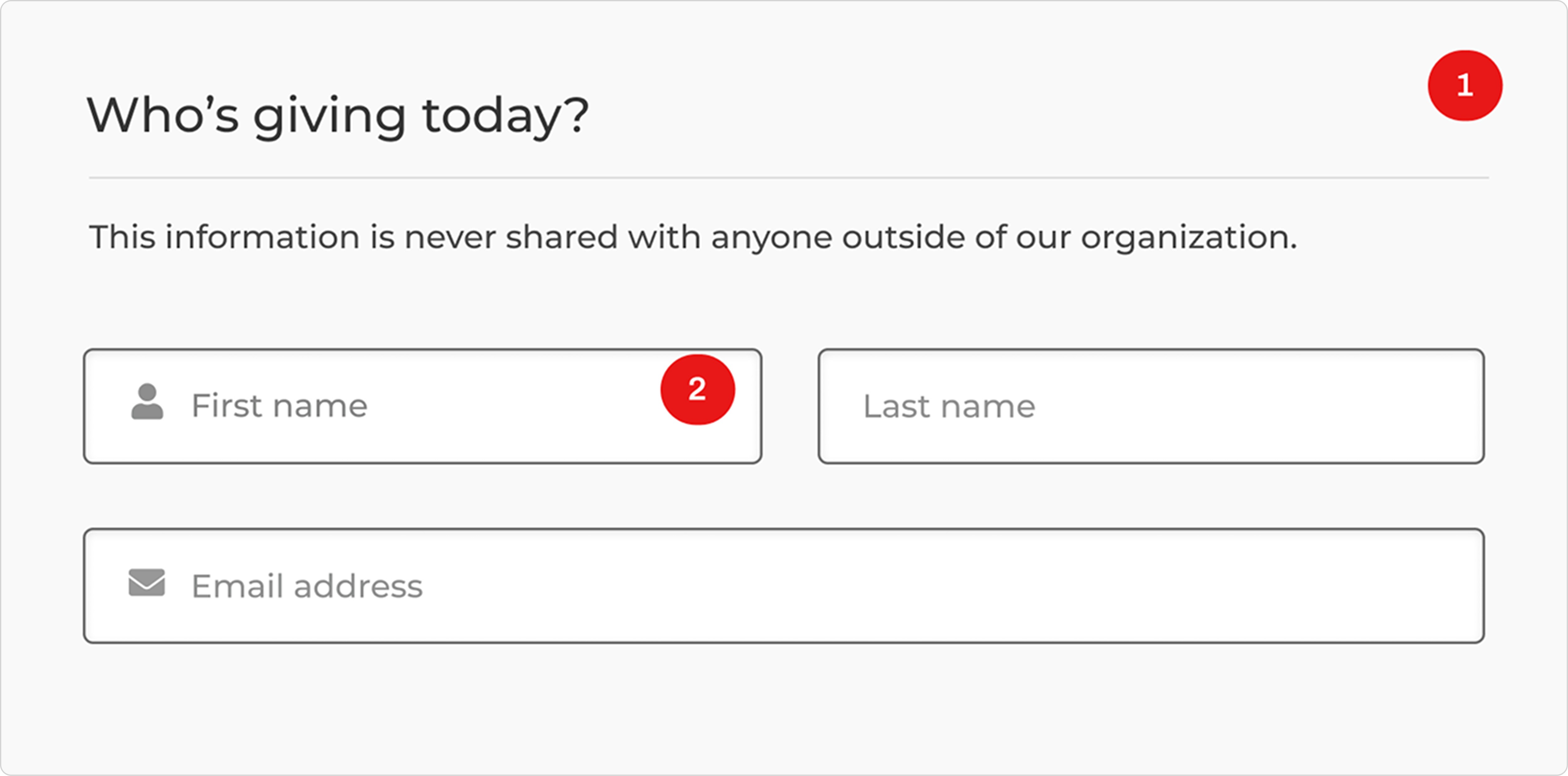
Donor Info Section
This is where donors input their personal details. The goal in this section was to make the input components consistent in all our forms.
Audit Findings
The new direction for our new forms required us to change the alternating background fill for sections.
I noticed some inconsistencies with input fields on the form. For example, the current custom amount input field is different from the other input fields.
Solution
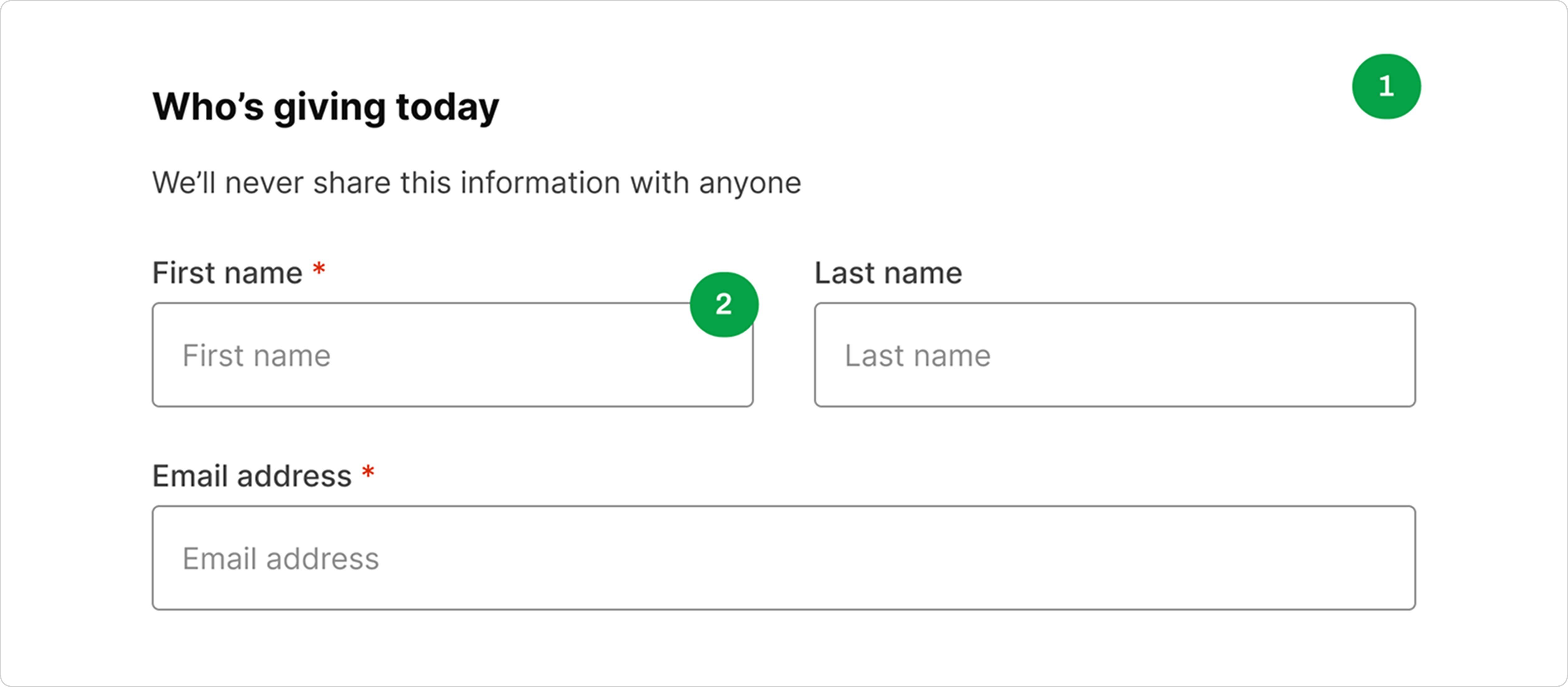
Removed the background fill to ensure consistency across all sections. To maintain uniformity, I ensured that the headings and descriptions of each section look the same.
Updated the input fields with their respective components. Below is a screenshot of the text input component for our forms.
Payment Details Section
Goal: Make it cleaner and consistent
Audit Findings
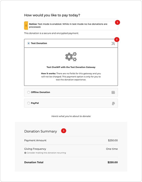
The notice component design needed to up be updated because it didn't match other notice components in some of our pages.
We wanted donors to see their donation summary after filling in their details; having the payment gateways show before that wasn’t the ideal experience. Additionally, I noticed the active state of the payment gateways wasn't clear and the default state had a fill which matched the donation summary, making it hard to scan.
The donation summary needed to be the first thing donors see in this section.
Solution
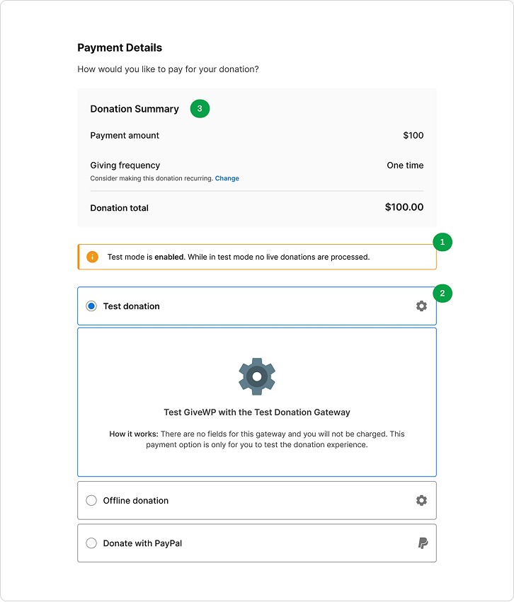
Updated the design for the notice component.
Changed the position and states of the gateway component, keeping a clean and simple direction in mind.
Moved the donation summary to the top. This ensures that donors see it before the payment gateways. Additionally, added a CTA to allow donors to change their donation frequency, encouraging more recurring donations and thus higher impact for organizations.
Reflections
This was an awesome experience, requiring a lot of system thinking to ensure design consistency across all our custom fields and form layouts.
Thinking of taking your idea from 0 to 1? From an idea to a desirable product?